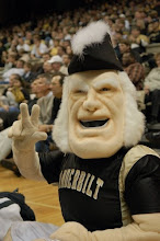
 Win or lose, the Vanderbilt football team is going to do it in style this fall.
We got a glimpse at the fresh-lookinguniforms that coaches, players and football staffers collaborated with Nike uniform experts to design. It features black, gold and white options for both jerseys and pants.
"The result of everybody's efforts and input is an extremely sharp looking uniform," said coach Bobby Johnson, "I think Commodore fans are really going to like this fresh new look."
I think so too. Some of the notable changes:
-The two-color stripe on the pants has been removed and replaced with a Nike swoosh and the team's official two-color "Star V" logo patch stitched on either hip.
-The two-color stripe on jersey sleeves has also been removed, replaced with a one-inch solid black stripe.
-A thin white or black piping extends from the front collar to the lower back of each jersey style.
-There's a color "Star V" logo into a "home plate" design in the front collar, and the same logo also has been added to the back of each jersey above the number, making Vanderbilt one of only a few teams nationally to feature such a design.
"All the guys are super excited about getting to see them," said co-captain Brad Vierling. "I know myself, George (Smith) and Reshard (Langford) were totally blown away when we saw them for the first time. It's subtle and not flashy, but it's sleek and fresh. The guys are going to love them."
Let's hope the new look translates into more victories on the field. You can check out the full gallery on VU Commodores right here.


4 comments:
I think Coach did a good job on getting a new look. Can't hurt us.
FREEEEEESH
i have a feeling the black ones will look dope. i wonder if you can see the white on gold numbers from the stands, but other than that fresh digs. the gold jersey black pant combo might look fresh in the same way those Cal uniforms did last year. i swear the guys look faster already.
Vandy had some of the nicest uniforms in the SEC until this change. They are simply victim of giving into a bad era in uniform design. While there isn't much tradition here, you will notice the programs that stay with the traditional modern stripes (Alabama, Georgia) rather than converting into this new commercialized look (Kentucky, South Carolina, Vandy) are the ones with a deep sense of tradition. If only maybe this can help the play on the field.
Post a Comment